Rebranding a global leader in mental health prevention — not just with a new look, but a new language. Strategy first. Design that follows direction.
Services
Client
Year
Website
Challenge
How do you express prevention without sounding clinical?
That was the line I walked. The challenge was creating emotional resonance without sacrificing credibility. Through tone, texture, and hierarchy, I designed a system that felt more like a conversation than a consultation — less institutional, more intuitive.

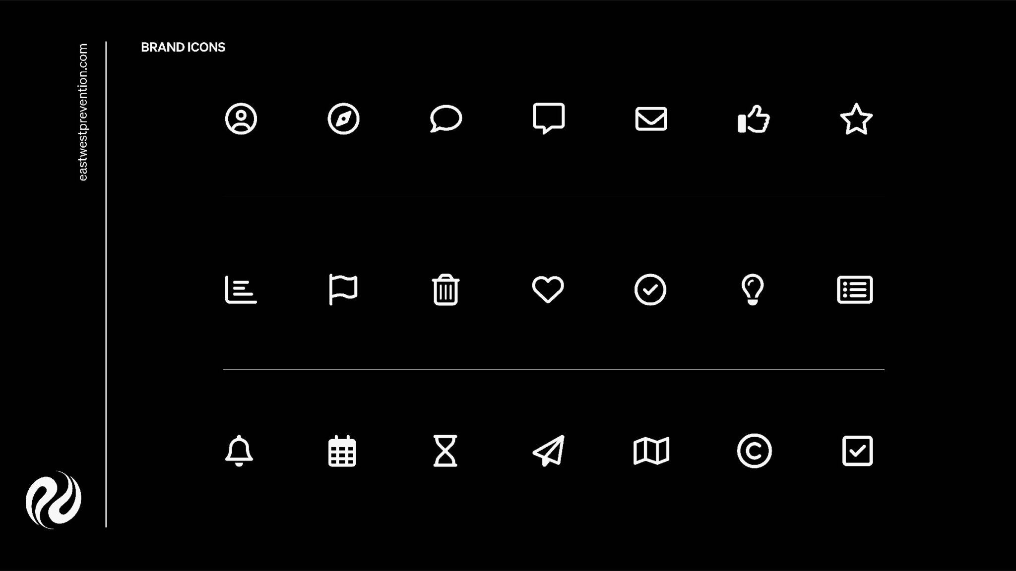
The Direction
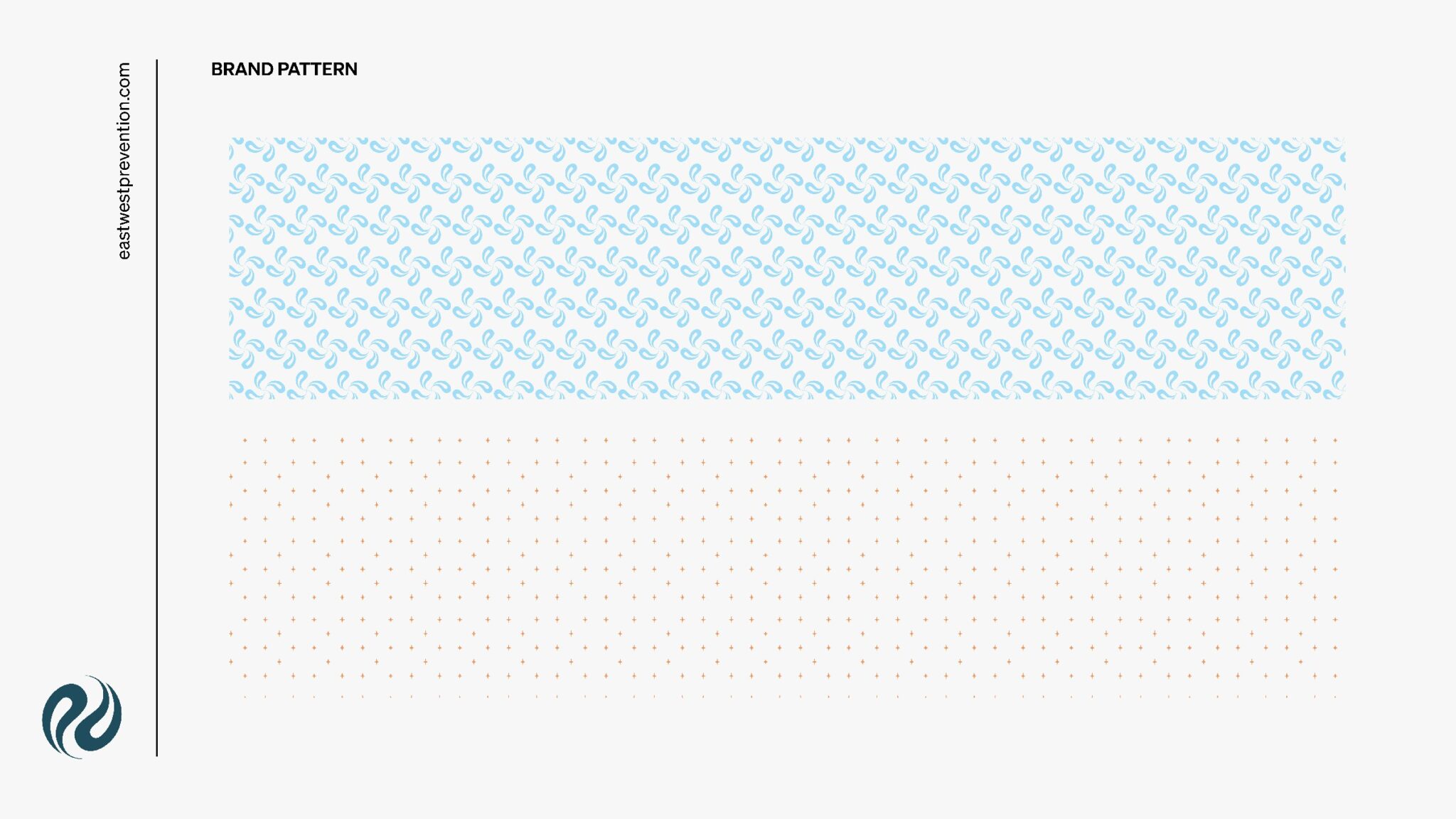
I stripped away the noise to reveal what mattered.
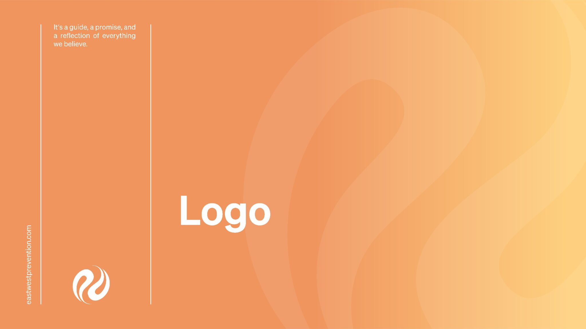
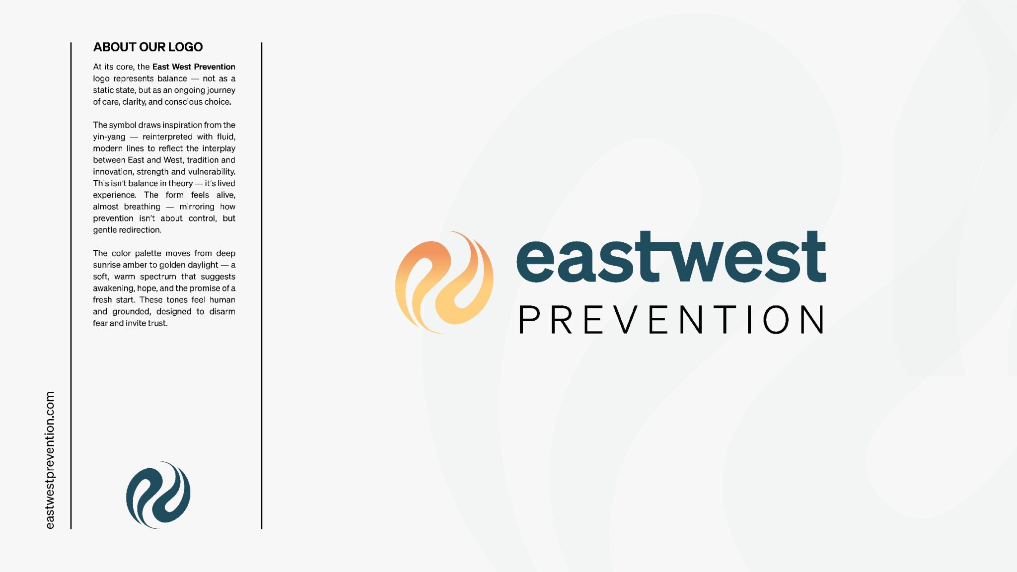
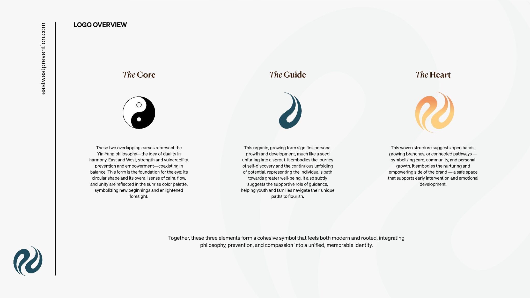
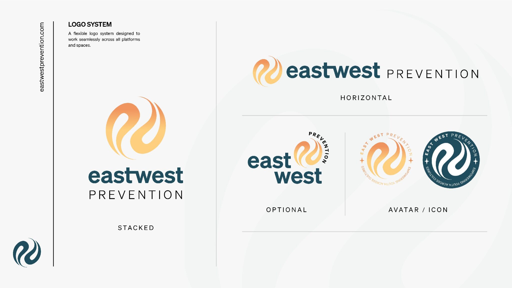
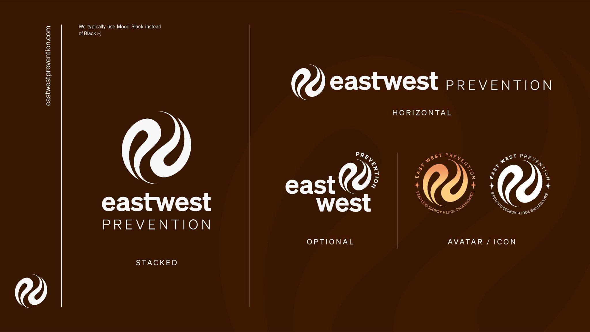
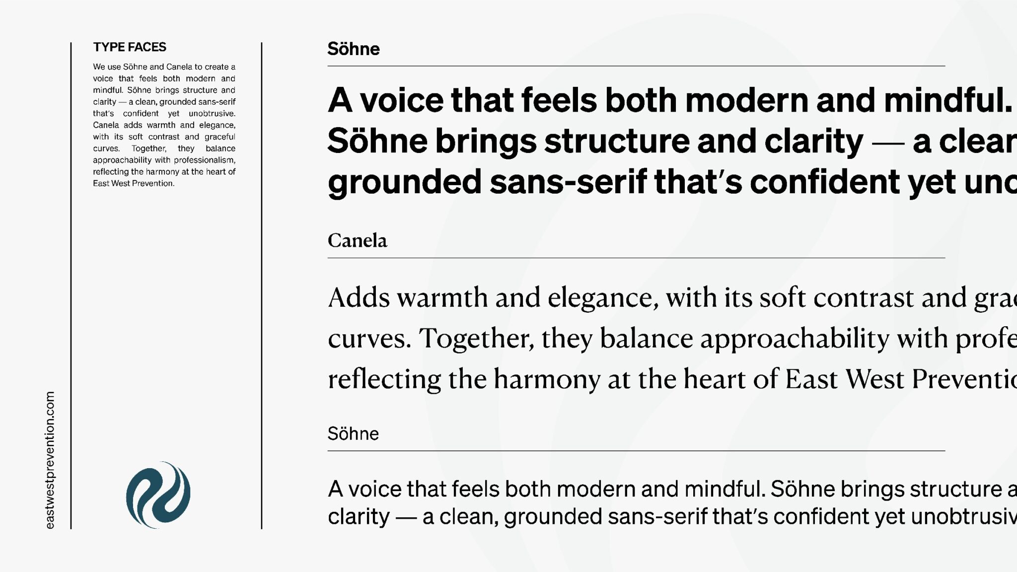
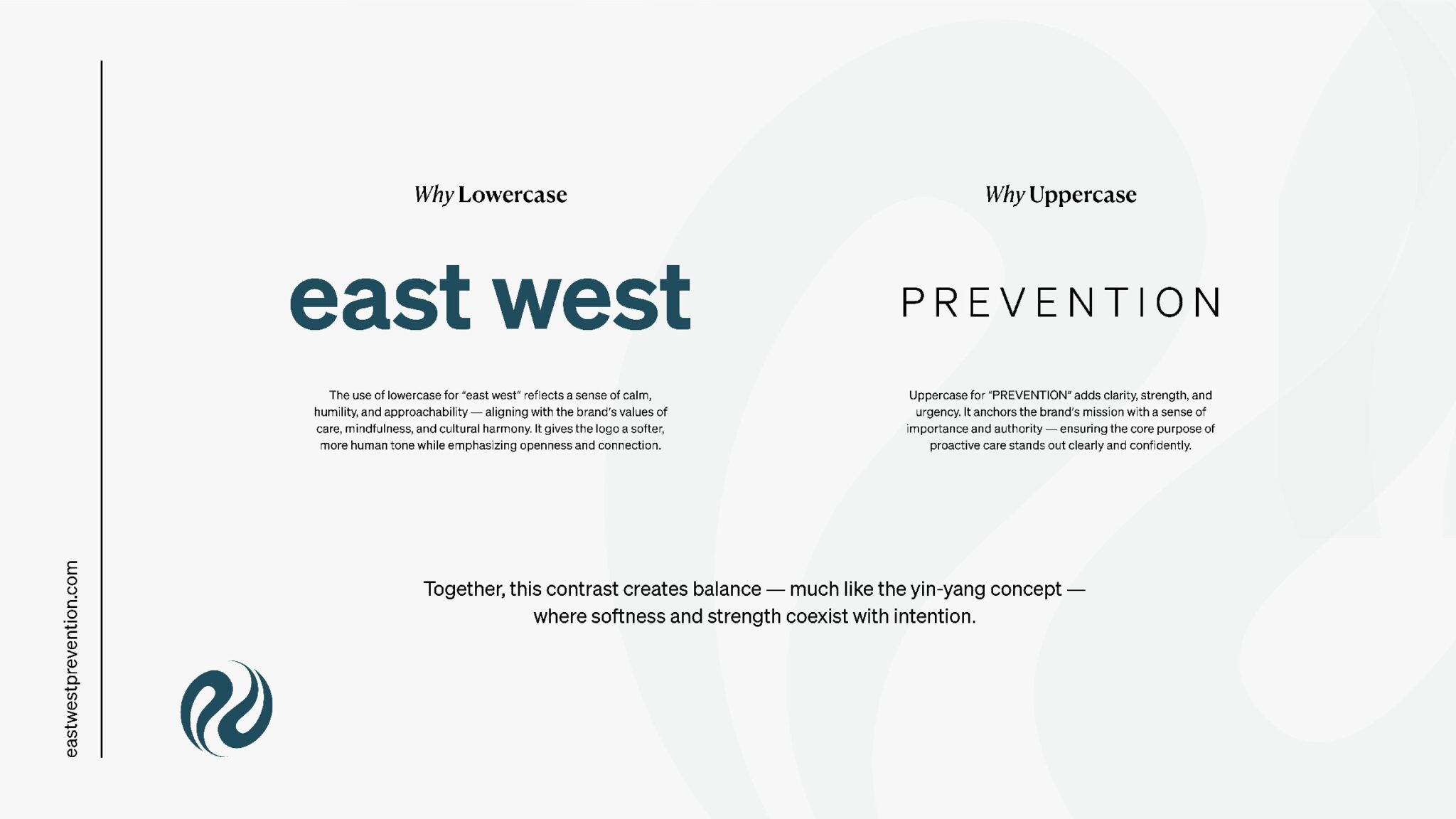
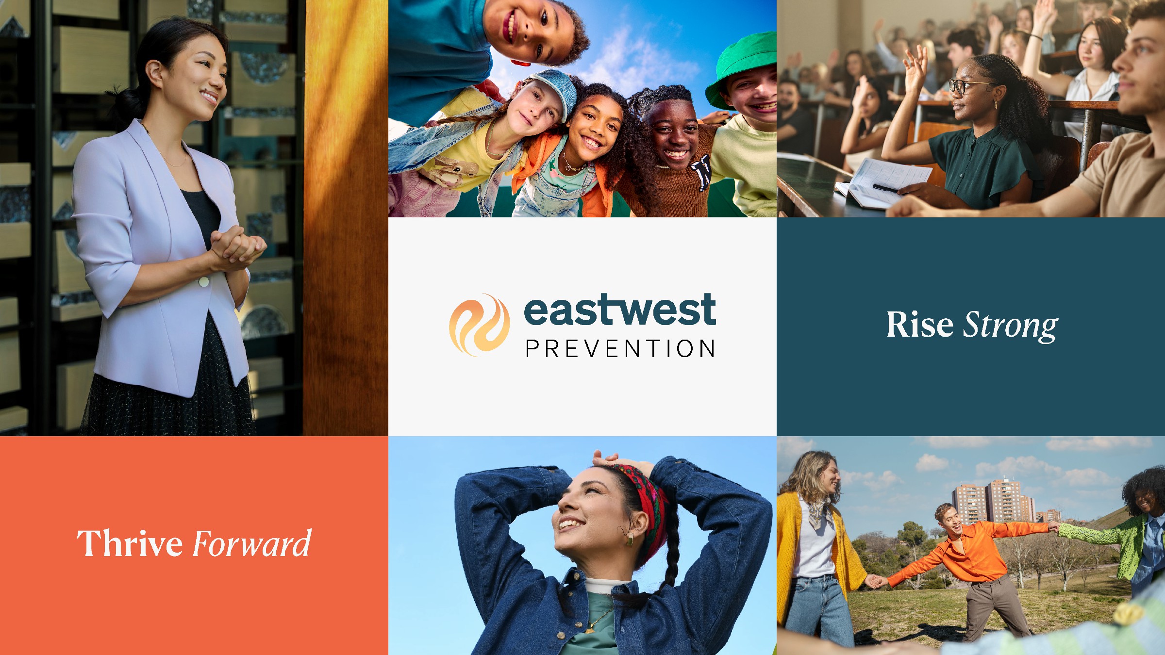
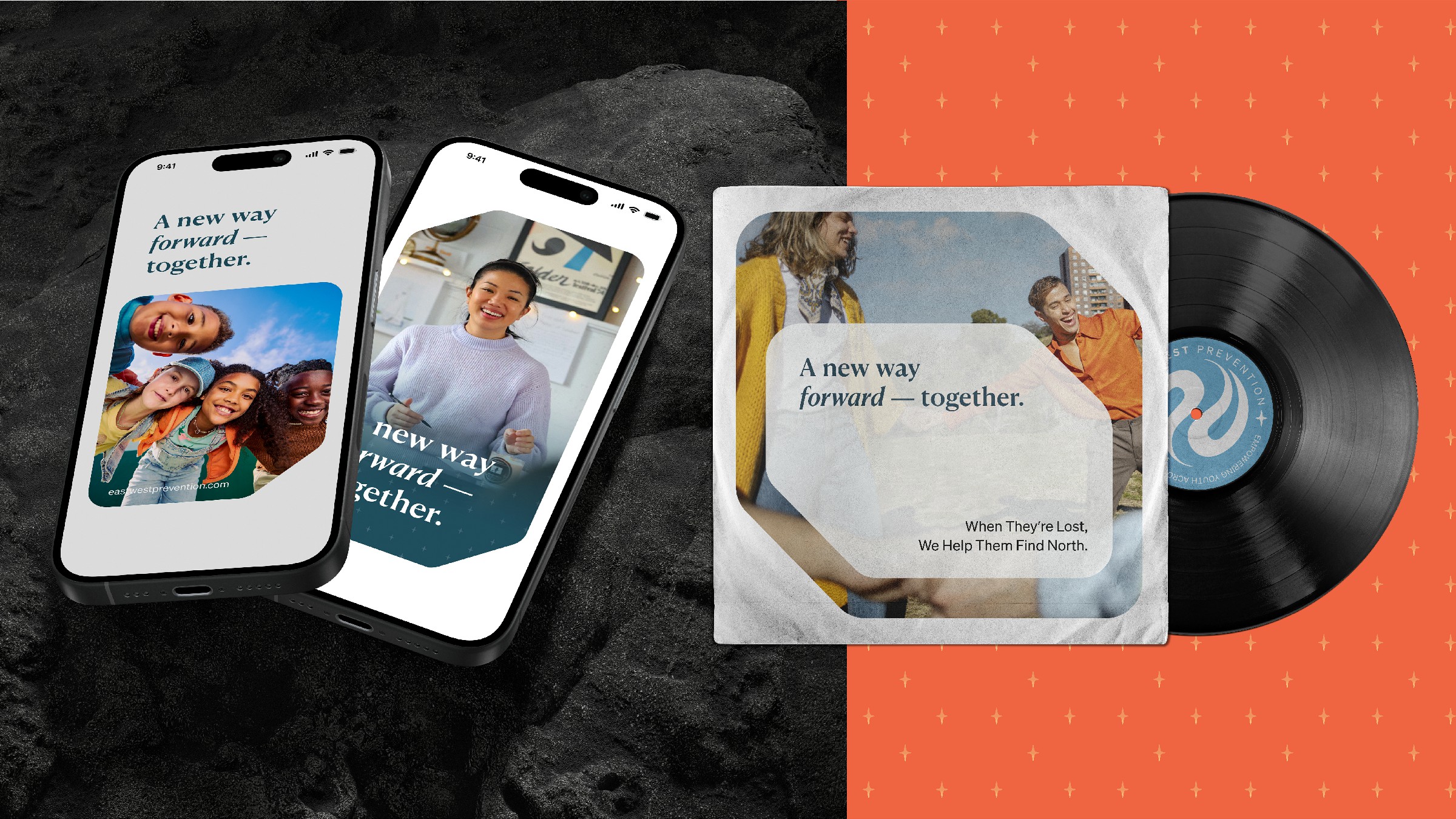
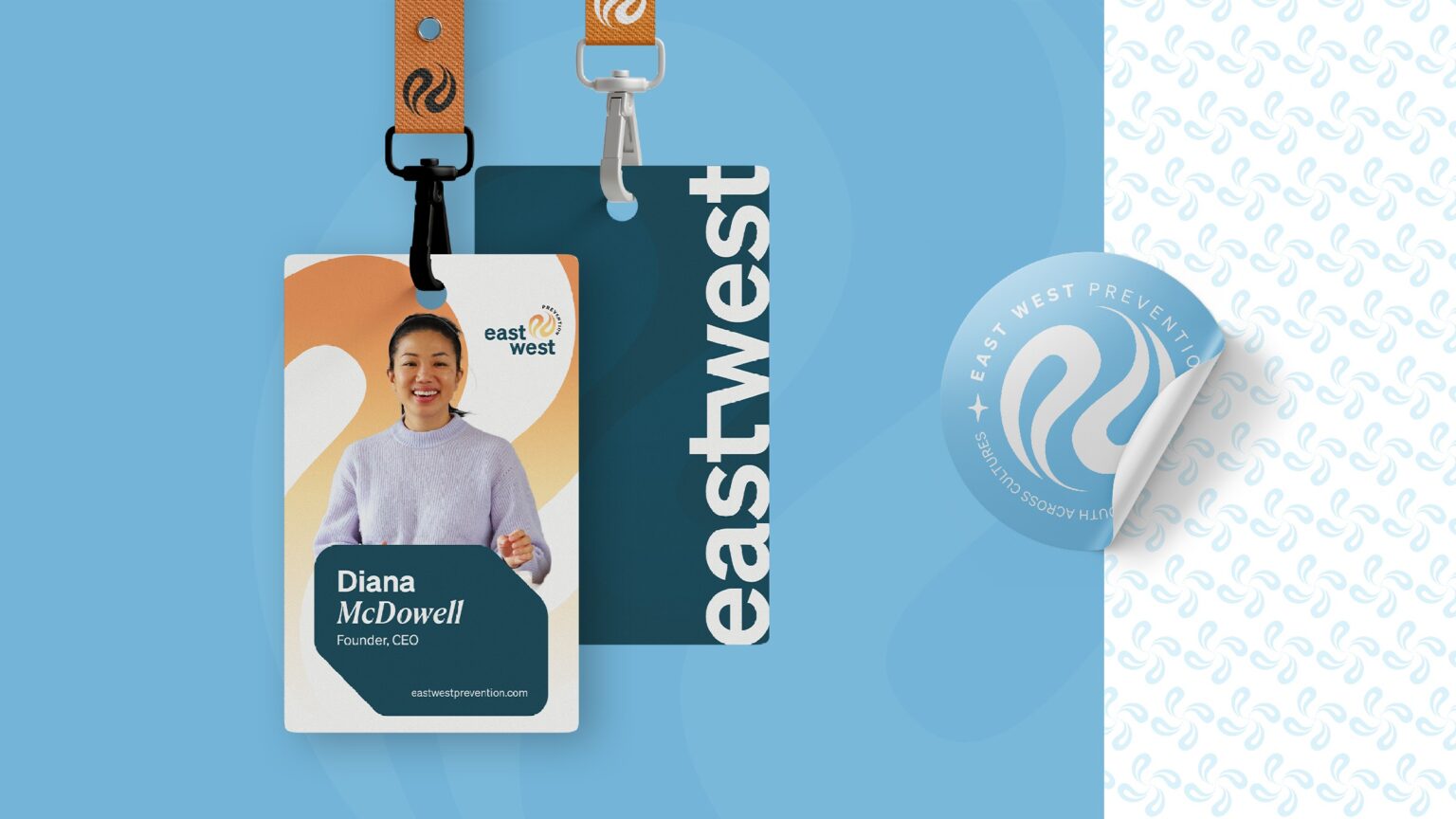
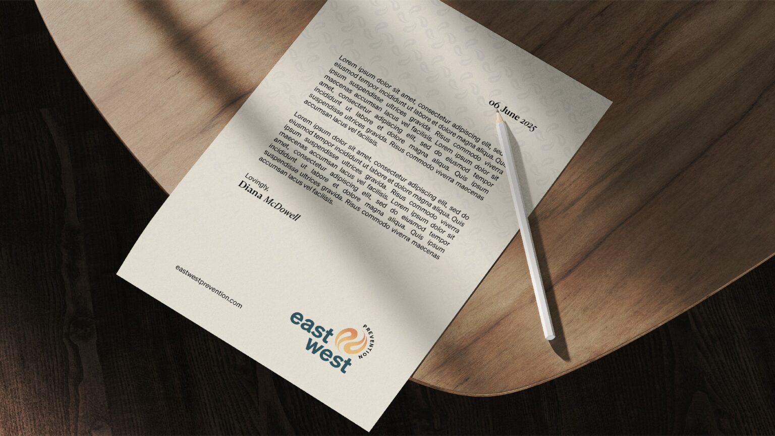
I led with clarity, not decoration. The new identity leans into simplicity without ever feeling sterile. A minimal logomark reflects the harmony of East and West — balanced, directional, and quietly powerful. The entire system was built to feel trustworthy without ever resorting to tired healthcare clichés.
The Impact
This wasn’t just rebranding. This was repositioning.
East West Prevention now walks into rooms it used to whisper in. With a refreshed identity, they speak with clarity, move with purpose, and finally look as confident as they are. This project reminded me why I do what I do — to help brands own their space without losing their soul.
Global credibility. Cultural sensitivity. Visual clarity.
Global credibility. Cultural sensitivity. Visual clarity.