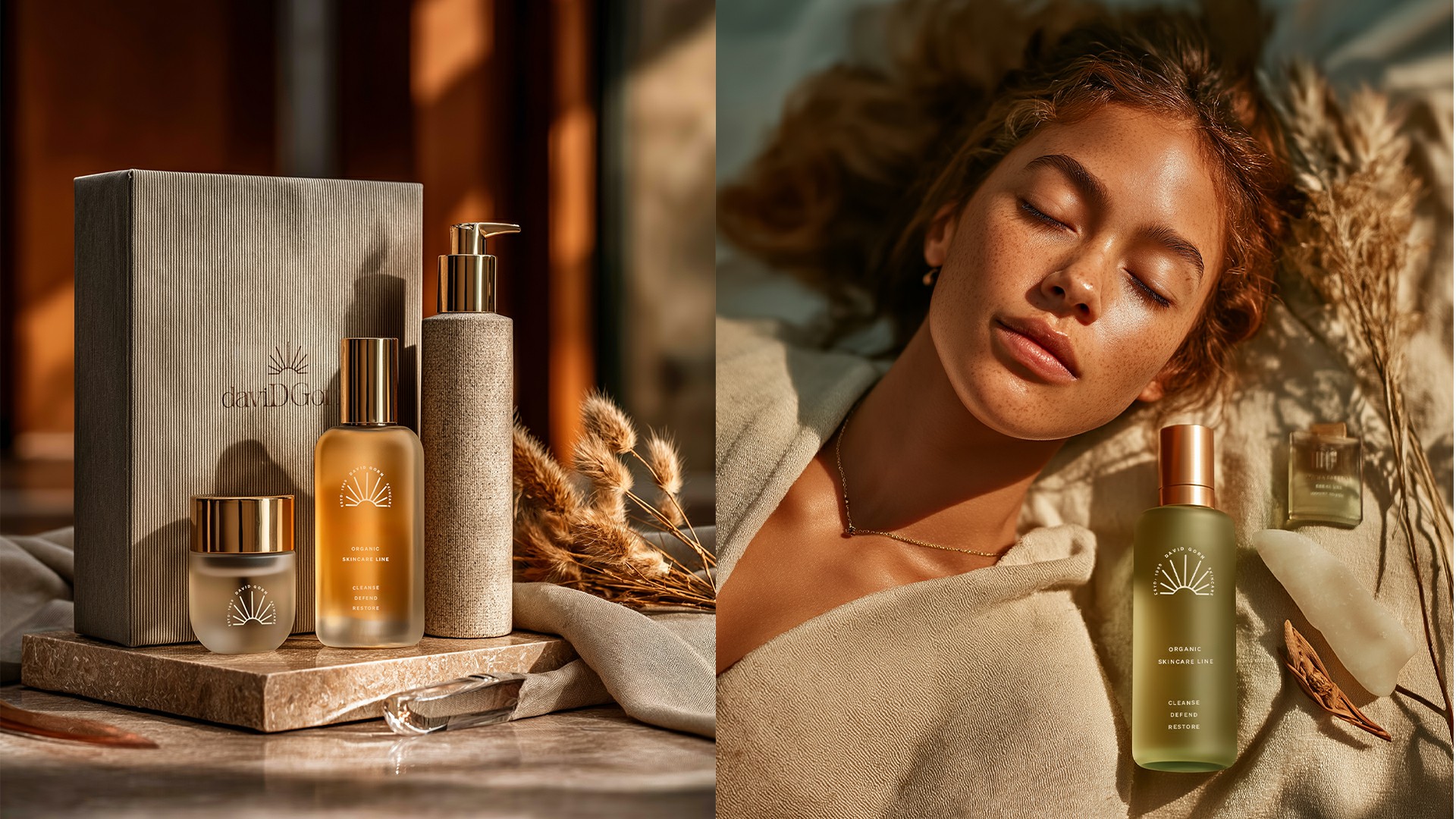
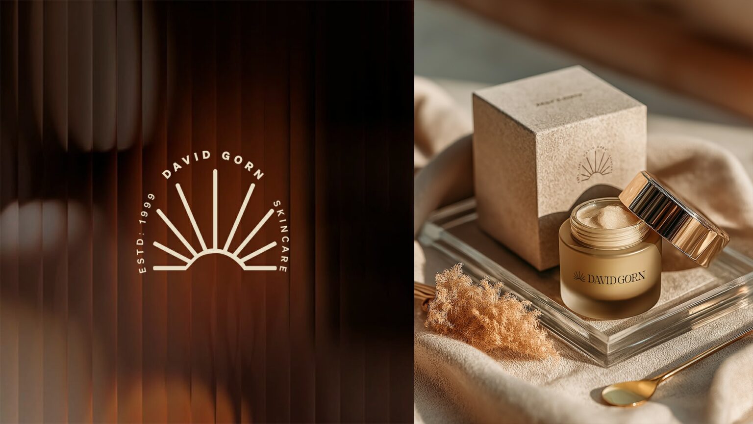
David Gorn is an imagined high-end organic skincare line that fuses minimalism with indulgence. The branding and packaging concept was crafted to express serenity, earth-conscious luxury, and tactile elegance — all designed to feel as good as the skin it’s made for.
The Challenge
Make it feel organic without going cliché.
The goal was to design an identity that looked pure, premium, and grounded in nature — without relying on tired earthy tropes. It needed to stand out on the shelf and feel aspirational in the hand — with just the right blend of warmth, minimalism, and sophistication.

The Goal
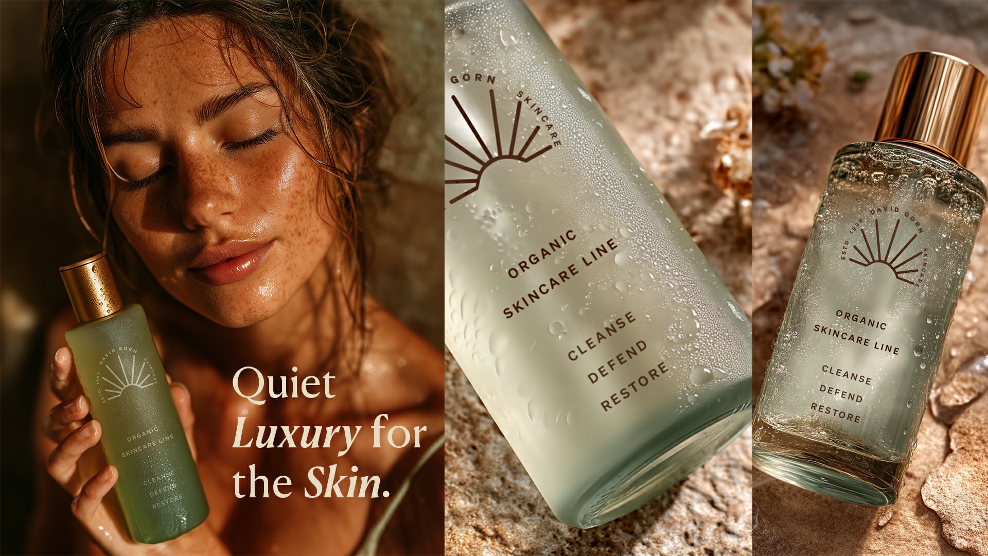
Design a brand that whispers elegance, not screams “natural.”
Every detail — from typography to packaging texture — had to reflect modern eco-luxury. The David Gorn system was built to appeal to discerning consumers who seek authenticity, calm, and clean beauty with presence.

The Impact
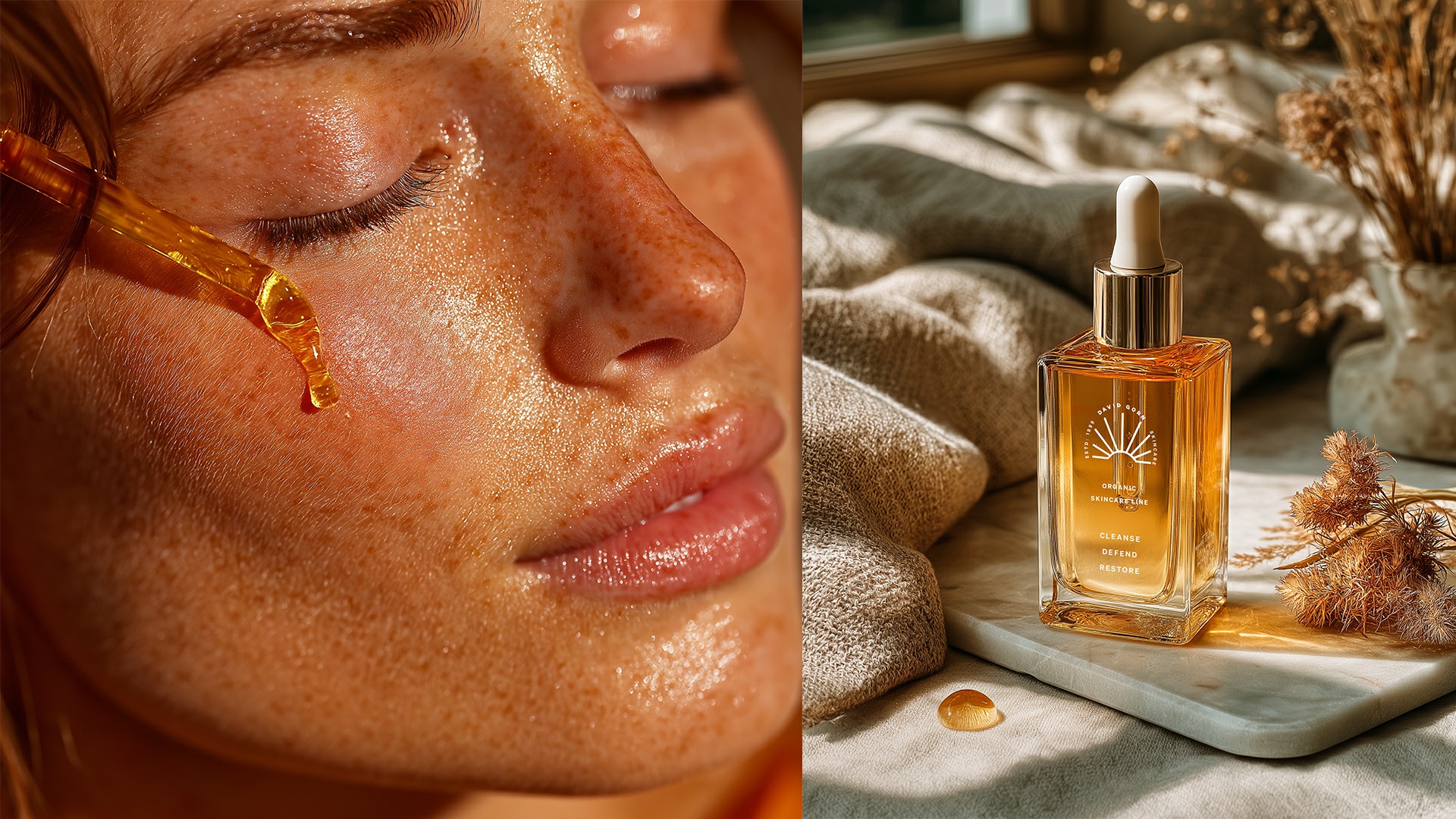
Elegance you can touch, purity you can feel.
This concept visually elevates what “clean beauty” looks like. It feels global, editorial, and deeply rooted in emotional luxury — the kind of brand consumers would display proudly on their counters, not just hide in bathroom drawers.
Quiet skincare for bold skin.

Quiet skincare for bold skin.